http://www.mookychick.co.uk/
Mookychick is possibly the closest competetor as far as content and house style go, as they both
Monday, 13 December 2010
Paragraph
My magazine is a look at alternative music and culture. Its aimed mostly at a female audience, but avoids being girly. It will show that you can be tough and alternative, without having to act like a man. It will appeal to my audience, as it coveres a broad range of music and different styles. The house style is grungy and gothic.
Friday, 10 December 2010
Masthead

I chose this masthead because the font is reasonably feminine, without being over the top girly, and the name pretty much sums up the attitude of the magazine. Distorting the way that alternative culture is viewed, and the main audience of this particular genre of music.

Wednesday, 8 December 2010
Mood Board

After speaking directly to some people who fit my target audience, I found out some other things which I decided to incoperate into my mood board. I found that most of my target audience liked things like retro games, piercings and tattoos, and a lot of quirky, iconic, gothic things.
Monday, 22 November 2010
Audience Profile

The most popular forms of music were Metal, Alternative and Rock, and my audience is predominately female with 70% of people taking gthe survey. My audience falls into the 16-21 age bracket, and they tend to be very creative people, with 60% of them playing an instrument and enjoying art.
When asked what other features they would like to see in a magazine, the most popular choices were; giveaways, gig guides, comedy and film.
They tend to spend a lot of time on the internet, which is where most of them find out about new music.
Sunday, 21 November 2010


Planning and Research - Magazine Analysis - NME

NME Magazine
NME's iconic masthead has remained fairly unchanged throughout the magazine's life and is instantly recognisable.
The bright colours seem to be a common thing with music magazines aimed at young people, they are energetic and eye catching.
The photo of the band makes them come across as confident, and the way they are all looking at the camera connects them with the audience, as they appear to be looking straight at them, It links in with the main article, which is also the double page spread. Unlike most magazines, the information isnt mostly in the left third, but pushed to the bottom of the cover, possibly due to it being a 'special preview issue'

Contents page
Very user friendly, the articles are divided into categories like in Kerrang! Which makes the pages easier to navigate
A large picture highlights another big article from the magazine, that was not important enough for the front page.
The band index down the left hand side is a quick, easy way to see who is featured in the magazine; it also features page numbers, to make finding them easier.
Subscription information is often featured on the contents page, as well as contact information such as email, and the magazine's website.
The contents page has a consistent house style, matching the colour scheme of the front cover.
The Double Page Spread

This is mostly picture based, featuring the band from the front cover, another image from the photo shoot, giving an air of relaxed confidence, and connecting with the reader.
The names of the writer and photographer are given next to the article title, a short introductory line runs underneath to give an idea of what the story will feature, before the main article begins underneath. Drop caps start the article, and the next main paragraph after that.
Monday, 11 October 2010
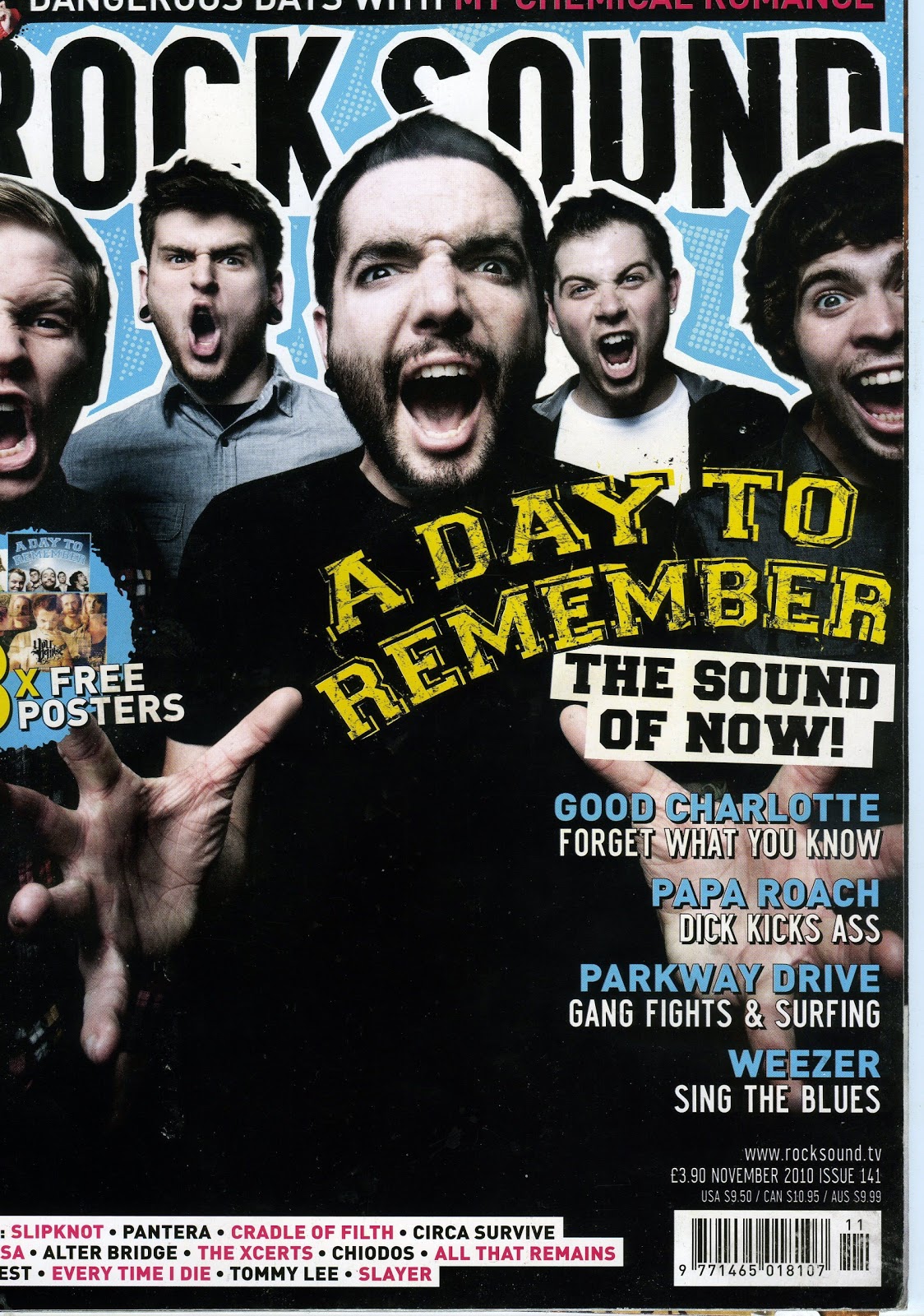
Planning and Research - Magazine Analysis - Kerrang!
 Kerrang! Magazine
 Masthead:
Bold, shattered grungy looking text, fits with audience of young adults, metal music fans.
The colour scheme involves a lot of black, red and yellow, all energetic colours associated with danger or warning
Lead article:
My Chemical Romance, The lead singer is featured as the cover image, and the pull quote gives an idea of what happens in the interview. Most fans will want to know the ‘inside story’ of the albums, so this is a good selling point.
The name of the band isn’t just typed on in a normal font; they used the band’s new logo.
The language used on the skyline is quite forceful and aggressive, “You Me at Six Take Australia!” “Rob Zombie Terrifies America!” and The use of all caps across the magazine works with the colour scheme to make it quite an ‘in your face’ and exciting cover.
There is an even spread of information across the cover, but the most important are in the left third. This is where the lead article is, and an image telling you that it is a collector’s cover, and there are 4 to collect. The magazine will be the same inside but feature a different member of the band on each one, to encourage the readers to buy them again.
If all the big fans did this, it would dramatically increase sales, so it’s a clever marketing pitch.
If all the big fans did this, it would dramatically increase sales, so it’s a clever marketing pitch.
Along the bottom, there is a list of other bands that appear in the issue, encouraging readers who may not necessarily be fans of the band in the lead article to buy the magazine as well.

Contents Page
The colour scheme of the contents page fits in with the front cover, keeping in with house style,
The contents is divided into sections under headings, such as 'News' and 'Live Reviews' with page numbers, making the page very user friendly, some of the bigger stories have got their own picture, drawing the reader's attention in

Double Page Spread
Again the bright colours and bold fonts are keeping with the house style,
The spread is mainly picture led, with the band looking toward the reader, their poses full of attitude, and energy, which really appeals to their fans and the type of people who read this magazine. The clothes and hair are alternative and interesting too, something that a lot of metal fans will relate to and enjoy seeing.
Friday, 8 October 2010


Subscribe to:
Comments (Atom)