NME Magazine
NME's iconic masthead has remained fairly unchanged throughout the magazine's life and is instantly recognisable.
The bright colours seem to be a common thing with music magazines aimed at young people, they are energetic and eye catching.
The photo of the band makes them come across as confident, and the way they are all looking at the camera connects them with the audience, as they appear to be looking straight at them, It links in with the main article, which is also the double page spread. Unlike most magazines, the information isnt mostly in the left third, but pushed to the bottom of the cover, possibly due to it being a 'special preview issue'
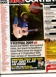
Contents page
Very user friendly, the articles are divided into categories like in Kerrang! Which makes the pages easier to navigate
A large picture highlights another big article from the magazine, that was not important enough for the front page.
The band index down the left hand side is a quick, easy way to see who is featured in the magazine; it also features page numbers, to make finding them easier.
Subscription information is often featured on the contents page, as well as contact information such as email, and the magazine's website.
The contents page has a consistent house style, matching the colour scheme of the front cover.
The Double Page Spread

This is mostly picture based, featuring the band from the front cover, another image from the photo shoot, giving an air of relaxed confidence, and connecting with the reader.
The names of the writer and photographer are given next to the article title, a short introductory line runs underneath to give an idea of what the story will feature, before the main article begins underneath. Drop caps start the article, and the next main paragraph after that.


No comments:
Post a Comment